Sweet Baby Ray’s
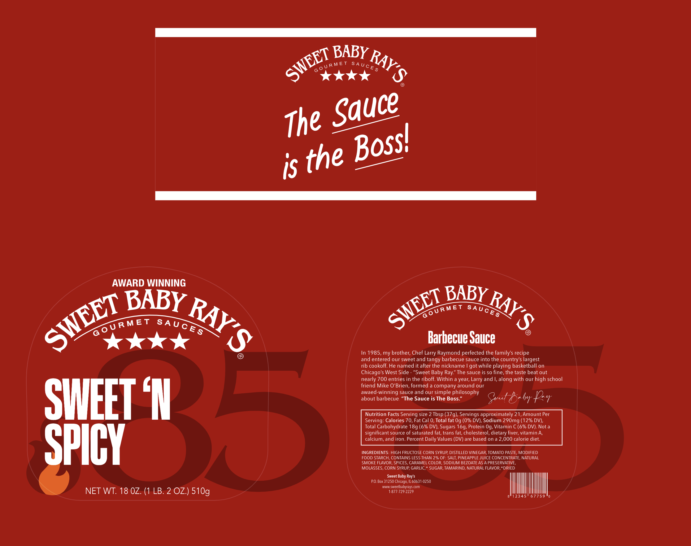
It all begins with an idea. The strategy for this project was to create a design that was clean, simple, but yet effective. The purpose of this project was to redesign a brand without redesigning the logo. Here you will find three redesigns with a two-tone color the represent the flavor. Featured is three flavors: original, sweet ‘n spicy, and roasted garlic. The redesign is also meant to celebrate another year of a successful brand. The company began in 1985 so that was a big part in the redesign.